People have difficulty understanding distributions. This can be seen in the survey presented in the recent documentary by David McWilliams (which I haven’t seen yet, but am looking forward to watching). In an ‘ideal’ world survey respondents said the top 20% would get slightly more than 30% of net wealth, and the bottom 17%. But in this ‘ideal’ world the bottom 20% are actually richer than those in the middle 60%. Obviously this is impossible.
As pointed out by Seamus Coffey in a blog there is a relationship between aging and wealth as people save for retirement, and then draw down on their savings. It is useful to set out an ‘ideal’ world of saving and drawing down, and then see what wealth distribution emerges. This will show the limits of what can be achieved in a ‘fair’ world.
An “ideal” world
In this “ideal” there is no inheritance, no college debt (so everyone gets the same start), income for those of working age is equal, and everyone of the same age has the same net wealth. Each year people save one unit of their income, and then draw down on this when they retire. They leave no assets behind when they die. (I set working age at 23-67 to allow for new pension rules, and people now stay in education longer, and the rate of return on investment at 4%. Age of death is 78 because it is conveniently 60 years after 18.)
In this world the share of net wealth by age is remarkably similar to what we see in the data.
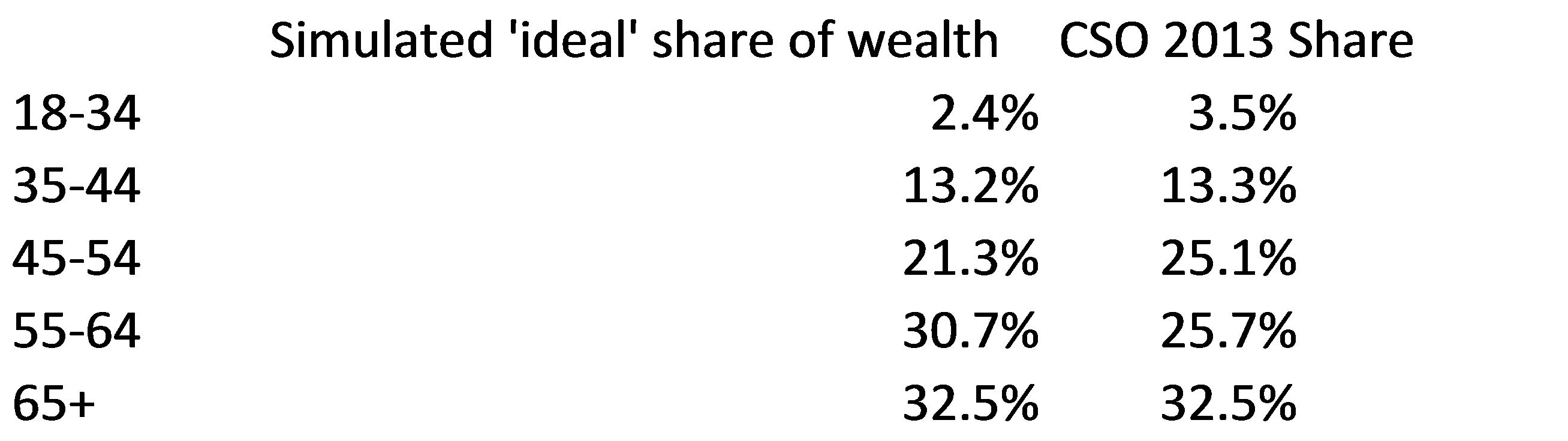
I was quite surprised when I saw this, so the Excel file is available here for people to play with (and alter assumptions).
Even in this “ideal” world roughly 45% of wealth would still go to the top 20% (as opposed to roughly one-third as respondents to the survey described as ideal).
However, there still space for a more equal world. Though the top 20% (aged 60-71) would get about 45%, this compares to roughly 72% at present. The top 10% would get a quarter of total wealth rather than half; and the top 5% would get roughly 13% of total wealth, rather than over 35%.
What drives this age based inequality?
Interestingly increasing the amount saved has no impact on measures of wealth inequality. If people double what they save over their life, the pie doubles, but they own the same share at each period. This is relevant as if pensions are provided by the state, and people only save a small amount as a top-up, it has no impact on wealth inequality statistics. (If this seems counter-intuitive, imagine if you saved in old punts rather than Euros; changing the scale doesn’t change dispersion.) Even in a communist country, so long as savings are possible, household wealth is likely to increase with age.
Increasing the rate of return on investment does increase the ratio of wealth of the old versus the young.
Caveats
Obviously this is a simplified view of the world (and a proper paper rather than a blog would go into more detail, and fine-tune the share of total population of each group). There are two main caveats:
- Wages tend to increase with age, and people increase their savings over-time. This serves to increase the young/old wealth gap.
- Overall wages increase over time. People in older cohorts, such as those born in the 1950s, had far lower wages during their entire working life compared to someone born in the 1980s. This reduces the young/old wealth gap.
Conclusion
Although in this “ideal” world the top 20% still hold a large chunk of net wealth, there is still plenty of space for a more equal distribution. Much of aggregate net wealth inequality is due to inequality within age groups. Those who are starting out in their working lives will likely continue to have very low levels of wealth. It is within the top 20% that the largest extremes exist.
[EDIT: Now online, how transfers to the young (similar to large wedding presents in the past), can help reduce age based wealth inequality.]
